I’ve been fiddling around in Excel today, so that I can display a timeline of various activities in a chart. (I think this counts as a Gantt chart, although there are no dependency arrows between the bars like you would see in MS Project.) I got the basic instructions from the help file, but there were a few extra steps that aren’t immediately obvious, so I’m documenting it here for my future reference; hopefully someone else will find it useful too. I’m using Excel 2007; the process will be similar for older versions of Excel, but I don’t know about other spreadsheet applications (e.g. OpenOffice).
For instance, suppose that you belong to various organisations and you want to keep track of your memberships. (I’m using fake data here, so don’t read too much into it!) Start by putting the list into an Excel worksheet:
| Activity | Start date | End date | Duration |
|---|---|---|---|
| Sky | 2007-03-01 | 2009-07-01 | |
| Gym | 2007-05-13 | 2008-05-13 | |
| WeightWatchers | 2007-08-20 | 2009-02-20 | |
| LoveFilm | 2008-02-22 | 2009-12-22 |
(I’m using the ISO 8601 date format here, to avoid UK/US differences.)
In the Duration column, use a formula to work out the number of days that have elapsed between the start date and end date. In most programming languages, you have to use a special function for this (e.g. DateDiff), but it’s very simple here. Assuming that you started in cell A1, the first duration cell will be D2, and the formula is “=C2-B2” (without the quotes). In this example, that will display 853. Select that cell, then move the mouse pointer over the bottom right corner so that it changes to a + sign. Press the mouse button, drag down to the other cells, and let go. This will apply the equivalent formula to all the other rows. Your table should now look like this:
| Activity | Start date | End date | Duration |
|---|---|---|---|
| Sky | 2007-03-01 | 2009-07-01 | 853 |
| Gym | 2007-05-13 | 2008-05-13 | 366 |
| WeightWatchers | 2007-08-20 | 2009-02-20 | 550 |
| LoveFilm | 2008-02-22 | 2009-12-22 | 669 |
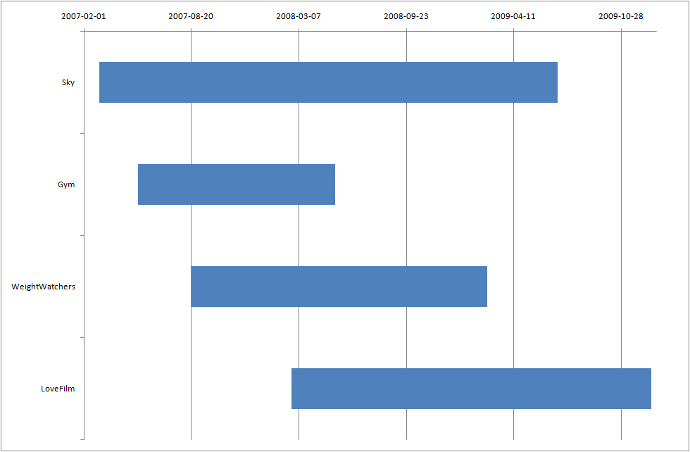
Highlight all the cells (A1:D5). On the ribbon, go to the “Insert” tab, click “Bar”, then on the top row (“2-D Bar”), choose the middle option (“Stacked Bar”). If you hover over each type of chart before you click it, a tooltip will appear to tell you the name. You will then get something like this in the middle of your worksheet:
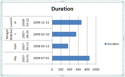
Hmm, not quite what we wanted! The first step is to move this chart to its own sheet, so that we’ve got more space to work. Right-click the chart, choose “Move Chart…” from the context menu, and choose “New sheet” in the dialog box. (I normally like to give things meaningful names, but “Chart1” will do for now.) Click “OK”, and off it goes.
The basic problem here is that the two dates have been included in the axis label, so this chart just shows us which activity lasted the longest, rather than illustrating the overlap between them. Right-click the chart, and choose “Select Data…” from the context menu.
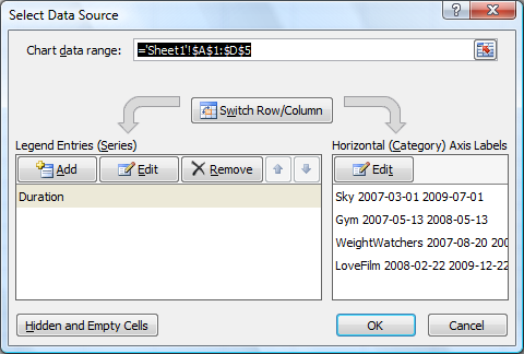
Click the “Edit” button under “Horizontal (Category) Axis Labels”:
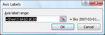
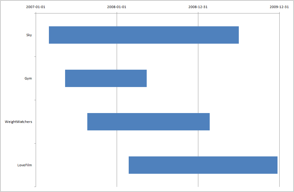
Change the formula to say “=Sheet1!$A$2:$A$5” (without the quotes), i.e. just the “Activity” column, and click “OK” in both boxes. That makes the chart look a bit neater:
The labels are now fine, but we still don’t see the start date or finish date. So, go back to the “Select data…” screen, and click the “Add” button under “Legend Entries (Series)”. Fill it in like this:
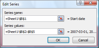
The easiest way is to click in each box, type =, then click on the appropriate cell(s). Click “OK”, and it will add “Start date” to the list of series. Use the arrow key to move this up, so that it’s at the top of the list, then click “OK” again.
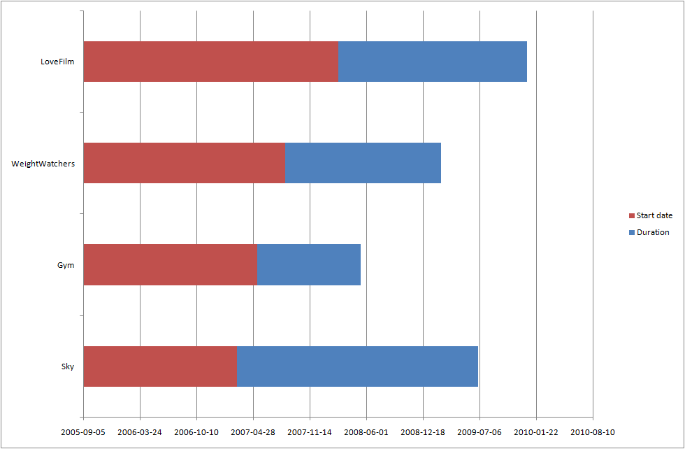
This looks a lot better, but we don’t want the red bars at the start. However, we can’t simply delete the series, otherwise we’ll be back in the same situation as before, where all the blue bars started at the same position on the left. Instead, we need to make the “Start date” bars invisible. Right-click on one of the red bars, then choose “Format Data Series…” from the context menu. Click “Fill” on the left, then choose “No fill” on the right, and click “Close”.
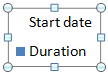
We can also get rid of the legend, since we know what the blue bars mean. Click on the legend to select it: make sure that the whole legend has a box around it, not just one of the data series.
Now press the Delete key on your keyboard, i.e. the one that says “Delete” on it, not the Backspace key.
Your chart should now look like this:
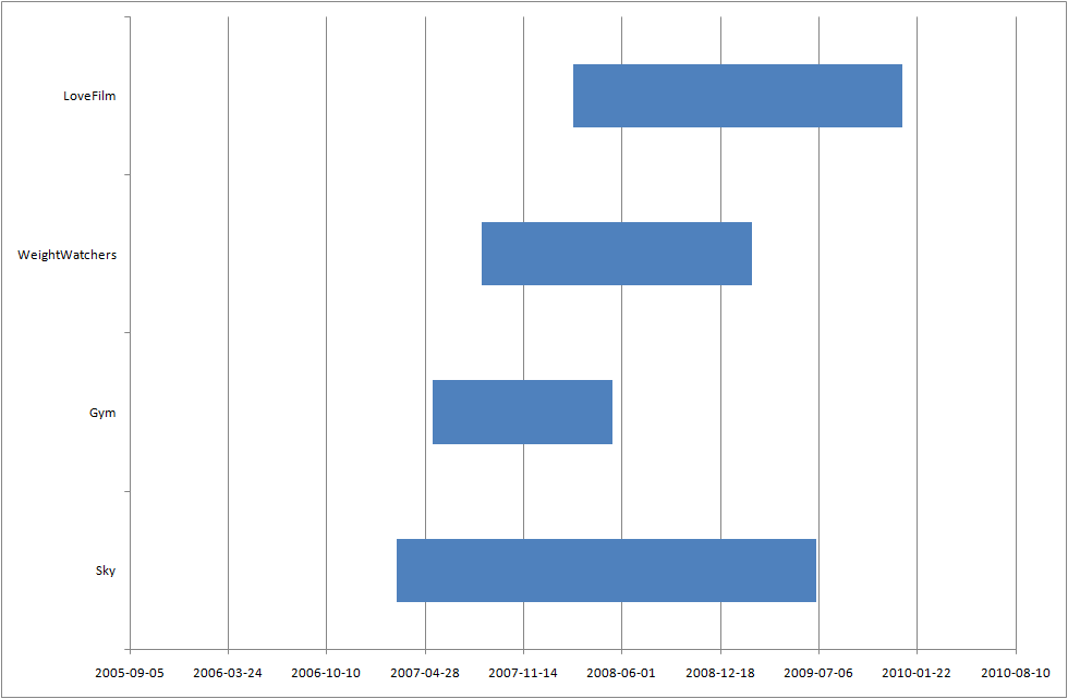
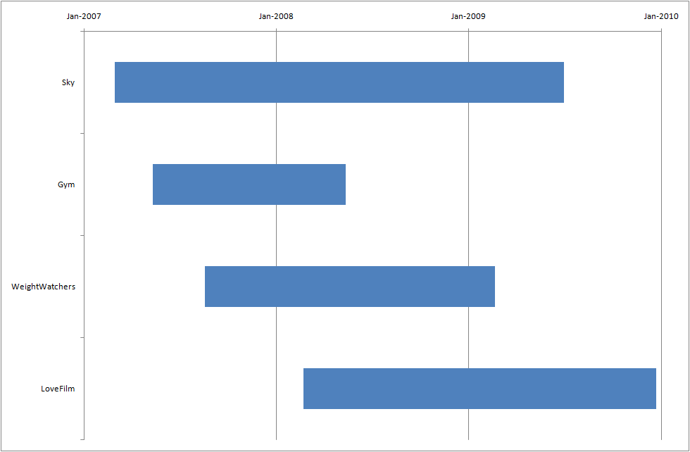
This is getting close to what we want, but there’s still a bit of tidying up to do. Right-click the vertical axis (where all the category names are) and choose “Format Axis…” from the context menu. Under “Axis Options”, tick the “Categories in reverse order” box, then click “Close”. This puts the activities into the same order we originally listed them, and puts the dates along the top of the chart.
That’s all fine, but there’s still quite a bit of wasted space at each end of the chart. Right-click the horizontal axis (where all the dates are), then choose “Format Axis…” from the context menu. Under Axis Options, you can manually specify the Minimum and Maximum values. However, if you look at the current values (greyed out), they’re numbers rather than dates.

At this point, it’s useful to understand what Excel is doing “behind the scenes”. When you enter a date, it stores that as the number of days that have elapsed since a particular date (called the “epoch”). So, 1st Jan 1900 = day 1, 2nd Jan 1900 = day 2, etc. Actually, it’s slightly more complicated than that, as Joel Spolsky explains (My First BillG Review), but that’s good enough for our purposes. Anyway, that means that you can’t simply say “Start on 1st Feb 2007”; instead, you have to tell Excel to start on day 39,114.
So, how do you work out that number? Rest assured, I don’t expect you to count all the days since 1900 on your fingers! Instead, find an empty space on one of your worksheets, and type in a date. In another cell, use a formula to refer to the first cell. For instance, you could type “2007-02-01” into cell F5, then “=F5” into cell G5. (As usual, don’t type the quotes into either cell.) This seems a bit pointless, until you get to the next step: select the second cell (G5), and change the format to “Number”. This will now tell you the number of the date you entered, which you can use in axis options. Type a different date into the first cell (F5), and the second cell will automatically update itself, so you can use this method to convert as many dates as you like. In this example, I think it would be neater to finish on 1st Jan 2010, which is day number 40,179.
So, go back to your chart, right-click on the horizontal axis, and choose “Axis Options” from the context menu again. For “Minimum”, change “Auto” to “Fixed” and type “39114” into the box (don’t put in a comma). Similarly for “Maximum”, change “Auto” to “Fixed”, and type “40179” into the box, then click “Close”.
The chart now looks like this:
That’s pretty much there, except that the date markers look a bit weird. In this case, it would be neater to start the chart on 1st Jan 2007, then have one marker for each year. So, find out the number for this date (39,083). Then right-click the horizontal axis again, and choose “Axis Options” from the context menu. Change the minimum value to 39083, then change “Major unit” from Auto to Fixed, and enter “365” as the value (i.e. one year), then click “Close”.
Ok, that almost worked! We now have two axis labels that say “1st Jan”, and two that say “31st Dec”. What went wrong? The problem is that 2008 was a leap year, so it had 366 days. Unfortunately, because Excel is just dealing with numbers rather than dates, there’s no way to specify “one calendar year”. There’s a similar problem if you want to have major or minor units each month, since the number of days in a month varies. So, my solution is to bodge it a bit.
Change the start date to be 2nd Jan 2007 (39,084); I won’t spell out how to do that, because it should be obvious by now if you’re paying attention. The four dates will then be:
* 2nd Jan 2007
* 2nd Jan 2008
* 1st Jan 2009
* 1st Jan 2010
If we then hide the “day” part of each date, and just show the month/year, it will look as if we’re dealing with the equivalent day each year. A bit sneaky, I know, but it gets the job done. So, go back to Axis Options for the horizontal axis, then the “Number” page, and click “Custom”. If “mmm-yyyy” is already in the list, select it. If not, type it into the “Format Code” box and click “Add”: this will add it to the list and select it so that you can use it. Now click “Close”.
In this case, there are only four axis labels, so we’ve got plenty of space between them, but if you have several labels then they may start to overlap. (In the real data I was working on, I had 17 labels.) The way to fix this is to change the alignment. Go back to Axis Options, then the “Alignment” page, and enter a custom angle; I found that -25° works nicely. However, for this example that makes things worse (half of the right-most label disappears), so it’s best to stick with Horizontal alignment. Just keep that in mind if you are dealing with more labels.
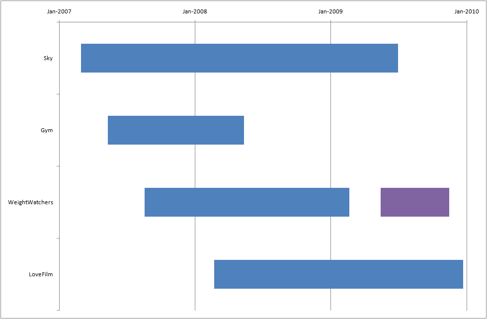
That’s basically it, if you just have one bar per activity. However, what if you want multiple bars per activity? For instance, I cancelled my WeightWatchers membership a few years ago, but they still keep sending me emails trying to get me to rejoin. So, go back to the original table and make a few changes:
| Activity | Start date 1 | End date 1 | Duration 1 | Start date 2 | End date 2 | Gap 2 | Duration 2 |
|---|---|---|---|---|---|---|---|
| Sky | 2007-03-01 | 2009-07-01 | 853 | ||||
| Gym | 2007-05-13 | 2008-05-13 | 366 | ||||
| WeightWatchers | 2007-08-20 | 2009-02-20 | 550 | 2009-05-15 | 2009-11-15 | ||
| LoveFilm | 2008-02-22 | 2009-12-22 | 669 |
I’ve renamed the 2nd-4th columns by putting a “1” on the end, then I’ve added some new columns: “Start date 2”, “End date 2”, “Gap 2”, and “Duration 2”. I’ve also entered two new dates for WeightWatchers. The new gap and duration cells are formulae. Assuming that this is row 4, enter “=E4-C4” for Gap 2, and “=F4-E4” for Duration 2. So, the duration formula is the equivalent of the old one, and the gap shows the number of days between the end date of the first bar and the start date of the second bar. The table will then look like this:
| Activity | Start date 1 | End date 1 | Duration 1 | Start date 2 | End date 2 | Gap 2 | Duration 2 |
|---|---|---|---|---|---|---|---|
| Sky | 2007-03-01 | 2009-07-01 | 853 | ||||
| Gym | 2007-05-13 | 2008-05-13 | 366 | ||||
| WeightWatchers | 2007-08-20 | 2009-02-20 | 550 | 2009-05-15 | 2009-11-15 | 84 | 184 |
| LoveFilm | 2008-02-22 | 2009-12-22 | 669 |
Go back to the chart, and you’ll see that nothing has changed; we need to explicitly add the new data series. So, right-click the chart, and choose “Select Data…” from the context menu. Click “Add”, and enter:
Series name: =Sheet1!$G$1
Series values: =Sheet1!$G$2:$G$5
then click “OK”. Click “Add” again, and enter:
Series name: =Sheet1!$H$1
Series values: =Sheet1!$H$2:$H$5
then click “OK”.
NB You need to select the whole column for the series values, even though only one row actually contains data. If you just choose that one cell, it will be linked to the first activity (“Sky”), which isn’t what we want.
Click “OK” in the “Select Data Source” screen, and we’ll see two new bars on the chart. As before, we want the “Gap 2” bar to be invisible, so right-click it, choose “Format Data Series…” from the context menu, go to the “Fill” page, choose “No fill”, then click “Close”.
You can extend to this to have as many bars per line as you like. (Well, within reason: Excel does have a limit on the number of columns per worksheet, but if you hit that then you’ve got a very cluttered chart!)
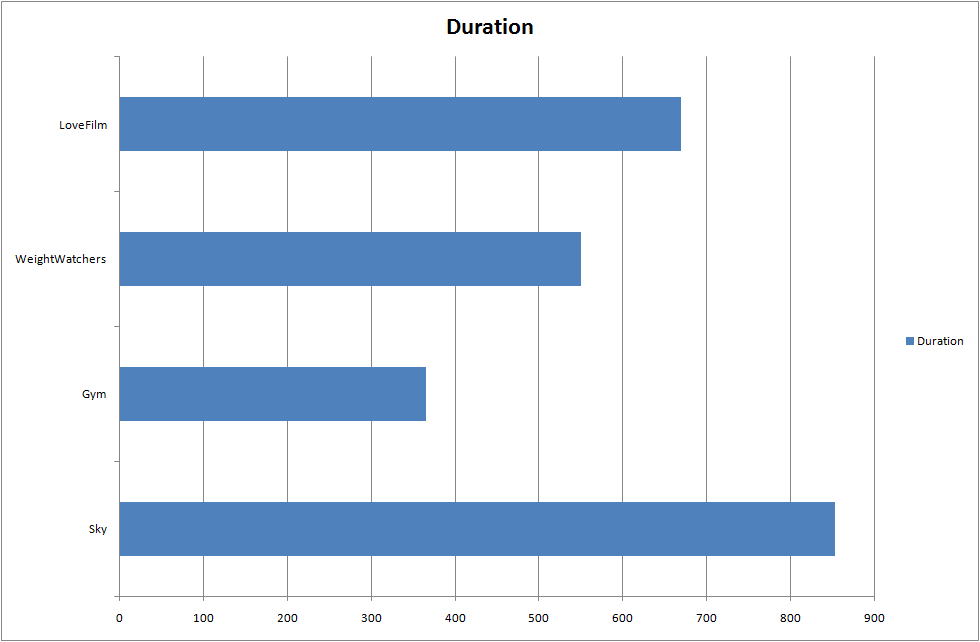
So, here’s the final version of the chart:
Here endeth the lesson; I hope it helps someone (possibly my future self).
Leave a Reply